The Power of Color Psychology in Graphic Design

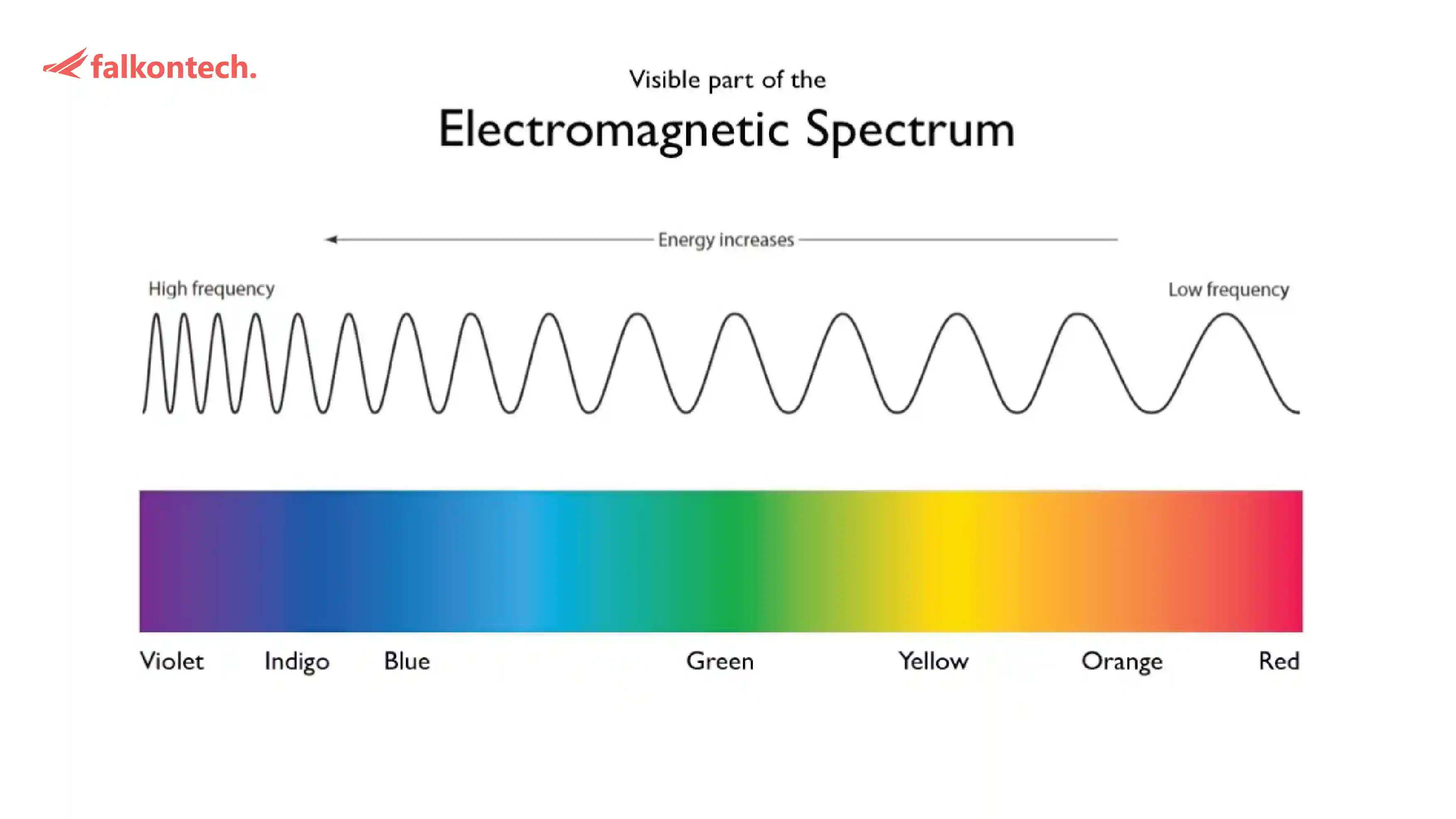
In marketing and graphic design, color psychology isn’t just about aesthetics it’s used as a strategic tool that influences emotions, decisions, and ultimately, consumer behavior. Colors trigger psychological responses that create a frequency in the human mind, shaping perceptions and compelling buyers to act. Here’s how it works and why it’s crucial in attracting more buyers:
Colors Influence Emotions and Decisions
Emotional Triggers: Colors evoke specific emotions. For example:
Red creates urgency and excitement, ideal for sales and promotions.
Blue fosters trust and dependability, often used by financial or tech brands.
Yellow symbolizes optimism and grabs attention, great for attracting impulse buyers.
Behavioral Impact: Studies reveal that 85% of consumers cite color as a primary reason for purchasing a product.
Building Brand Identity and Recall
Colors are essential to brand recognition, increasing recall by up to 80%.
Famous brands use color to convey their values:
Coca-Cola’s red evokes passion and excitement.
Apple’s minimalist white communicates innovation and simplicity.
Consistency in color across all platforms reinforces brand identity, making your brand memorable and trustworthy.
Enhancing Visual Hierarchy and Call-to-Actions
Colors help guide a viewer’s attention. For example:
Bright, contrasting colors like orange or green make "Buy Now" or "Learn More" buttons pop.
Subtle hues in the background allow bold colors to take the spotlight.
A well-thought-out palette creates visual harmony that holds a buyer’s attention longer, improving conversion rates.
Catering to Target Audience Preferences
Different demographics and cultural backgrounds respond uniquely to colors:
Younger audiences prefer vibrant colors like neon greens and pinks, while older generations lean toward muted tones like blues and greys.
Cultural context matters; for instance, red signifies prosperity in Asian cultures but can signal danger in others.
Encouraging Trust and Emotional Connection
Colors act as subconscious triggers. A buyer perceives a blue website as more professional and trustworthy, while a green logo suggests eco-friendliness.
Creating a sense of comfort and familiarity through color increases the likelihood of a purchase.
Boosting Sales Through Strategic Color Pairing
Contrasting color schemes improve readability and engagement. For instance:
Dark text on a light background improves clarity.
Complementary colors (like blue and orange) grab attention while maintaining balance.
In retail environments, warm colors like red and orange stimulate impulse buys, while cooler tones like green create a relaxed shopping atmosphere.
Pro Tips for Designers and Marketers
Research Before Choosing Colors: Understand your audience, industry, and brand message.
A/B Test Color Schemes: Experiment with different palettes to see which resonates most with your audience.
Balance Emotion and Function: While colors should evoke emotions, functionality should never be compromised.
Color psychology in graphic design goes beyond not only aesthetics but also it’s a science that creates lasting impressions, influences behavior, and drives sales. By understanding the subtle interplay between colors and human emotions, marketers and designers can craft powerful visuals that not only attract buyers but also build trust and loyalty.
Remember: Colors speak louder than words, so let them tell your brand’s story effectively.
Writer : Alrafid
